Color Field #02 – Echoes of the Earth

A study in rust, soil, and sun
Somewhere in the rusted fields of time, warmth lingers — quiet, weathered, and alive.
While Color Field #01 explored cold industrial tones and the stoic silence of aging metal, this issue steps into a warmer realm — one shaped by sun-scorched earth, oxidized steel, and dry winds blowing over forgotten terrain.
Recap|The Cold Ones – Color Field #01
Before diving into this new tone, let’s take a quick glance back at the silent grey palette of CF#01:
| Color | Tone | Description |
|---|---|---|
| C-35 IJN Grey | Steady, cold realism | "Like an old warship, still guarding a forgotten frontline." |
| C-40 German Grey | Heavy, battlefield pressure | "Steel hardened by years in the trenches, carrying silence." |
| C-61 Burnt Iron | Worn metal, resilient spirit | "Exposed mechanical bones, scorched yet still enduring." |
| C-11 Light Gull Grey | Pale, weathered ruins | "Sun-bleached ruins that no longer remember warmth." |
| C-65 Bright Blue | Cold spark of future energy | "A faint glimmer from a forgotten core deep within wreckage." |
→ Click here to read Color Field #01
Color Palette Overview|Tone Note 01

This time, we’re venturing into a color story built around earth, rust, and desert warmth. These tones aren’t flashy — they’re grounded, quiet, and honest.
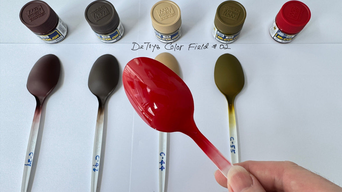
| Color | Description |
|---|---|
| C-29 Hull Red | Deep rust red. Bold and reliable, ideal for underlayers and outlines. |
| C-44 Tan | Gentle sand tone. Versatile for main color or bridging warm hues. |
| C-42 Mahogany | Deep reddish brown. Natural for shadows and transitional zones. |
| C-55 Khaki | A military base tone. Grounds the whole scheme with earthy realism. |
| C-68 Red Madder | Dark crimson-pink accent. Emotional and intense — use it sparingly. |
C-29 Hull Red
A classic red-brown. It’s deep, warm, and very matte. A great color for inner frames or rust base layers.

C-44 Tan
Soft and dusty. Think sun-faded canvas, or desert gear. Could be used as armor highlights or even cockpit interiors.

C-42 Mahogany
Leans darker than C-29 with more grey in the mix. Looks great next to metallics. Surprisingly good for joints and shadowy panel sections.

C-55 Khaki
A yellow-olive tone. Feels military but not too heavy. Blends well with warm greys or desaturated greens.

C-68 Red Madder
The only gloss in the set. Bright, punchy, and romantic—best as an accent. Use it for a surprise red panel, a warning line, or some retro decals.

Application Ideas & Color Harmony|Tone Note 02
This palette works especially well with desert-type builds, Zeon ground types, or anything weathered and heavy.
Tips:
- Use C-29 Hull Red as your base tone — it holds the palette together.
- Layer in C-44 Tan and C-42 Mahogany for tonal transitions and depth.
- Feeling too warm? Add touches of C-35 IJN Grey or C-60 RLM Grey to anchor the scene.
- Want drama? Try C-68 Red Madder as a tiny accent. A little goes a long way.
I tested a custom spoon combining C-29, C-44, and C-68, primed with gray surfacer 500. The result? A beautifully subtle rusted-metal blend — like a forgotten Char’s variant buried under desert winds.
I’m still in the middle of experimenting with colors — next, I plan to bring in some cooler tones from CF#01 and add a bit of weathering.

Surfacer Pairing Suggestions
Here are surfacer tests that worked well with this palette:
| Color | Suggested Surfacer | Notes |
|---|---|---|
| C-29 Hull Red | Gray surfacer | Gray gives realism; black increases saturation. |
| C-44 Tan | White surfacer | Helps reveal its light tone clearly. |
| C-42 Mahogany | Mahogany Surfacer 1000 | Accentuates its red-brown hue. |
| C-55 Khaki | Gray surfacer | Too dark a base turns it muddy green-grey. |
| C-68 Red Madder | Gray or black | Darkens mood and boosts color intensity. |
Builder’s Log|Real Usage Example - Falcon Cockpit
In the Millennium Falcon Rebuild Project, I applied both CF#01 and CF#02 colors to the cockpit door.
 Metal Structure:
- C-40 German Grey as base layer
- C-61 Burnt Iron layered on top
- Finished with black panel liner and subtle edge shading for depth
Frame Accent:
- C-44 Tan for the outer frame
- Light grey pastel dust and black wash for weathering
- Result: a balanced contrast between machine and memory
That Tan against German Grey felt surprisingly human — not cold, but aged and breathing, like an old machine that still remembers its purpose.
I love this kind of color — something that leaves an aftertaste.
What Comes Next|Tone Note 03
If you’ve followed this series from the start, you’ll see I’m building more than just palettes — I’m building a color logic system.
Cool tones give pressure.
Warm tones give memory.
Next time, we’ll let them collide.
Disclaimer
In this Color Field series, I share colors that I personally use, love, or have often seen leave a strong impression.
The descriptions, feelings, and suggested uses are based on my own experiences and impressions.
They are not strict rules — just inspiration.
I hope these colors will help you find your own voice in your creations.
Tagged: Color Field Color Field #02 Color Theory Earth Tones Model Paint Mr. Color


Leave a comment